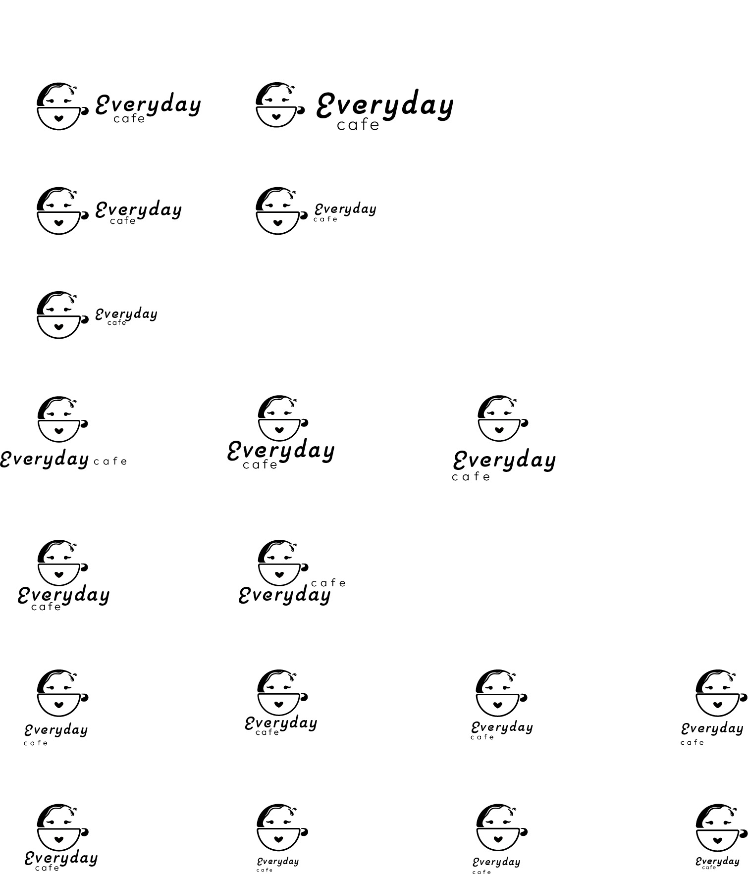
BRAND MARK AND SIGNATURE PROCESS
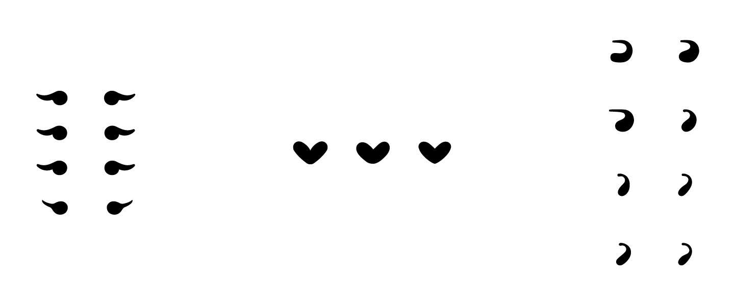
Digital Hand-Drawn Mark Sketches
Final Round of Digital Hand-Drawn Mark Sketches

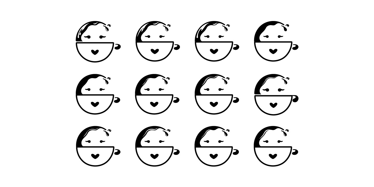
Evolution of Final Mark
Experimenting with placement and proportions.

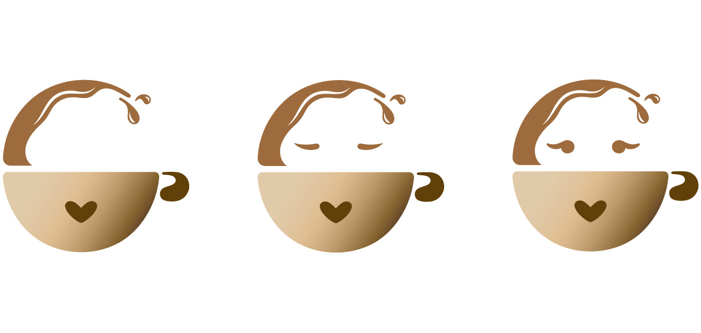
Eyes, Mouth, and Handle Iterations
Shine Exploration
Exploring the concept of simplification over detail.
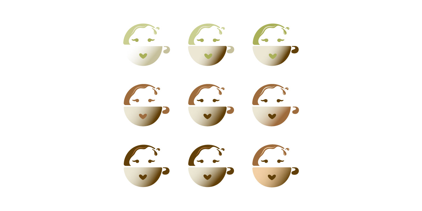
Color Exploration
Testing the matcha versus coffee concept and cup shadow adjusting.
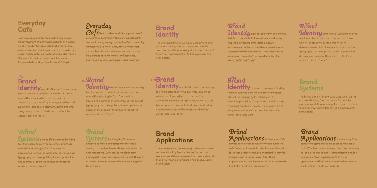
Exploration of Typeface Combinations
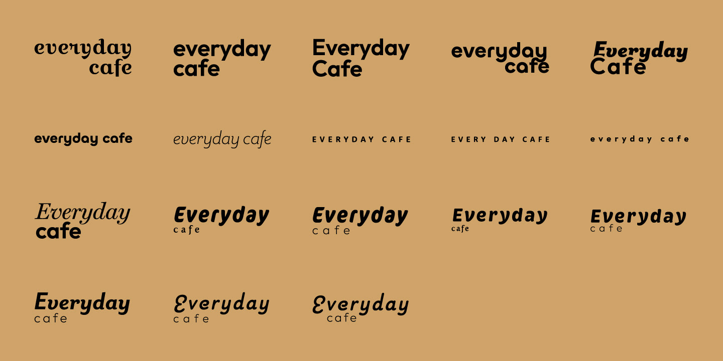
Vertical and Horizontal Signature Exploration
Adjusting the size ratio of the word "Everyday" to "Cafe" and the logomark to logotype. Also Exploring the placement of the words "Everyday" and "Cafe" together as "Everyday Cafe."
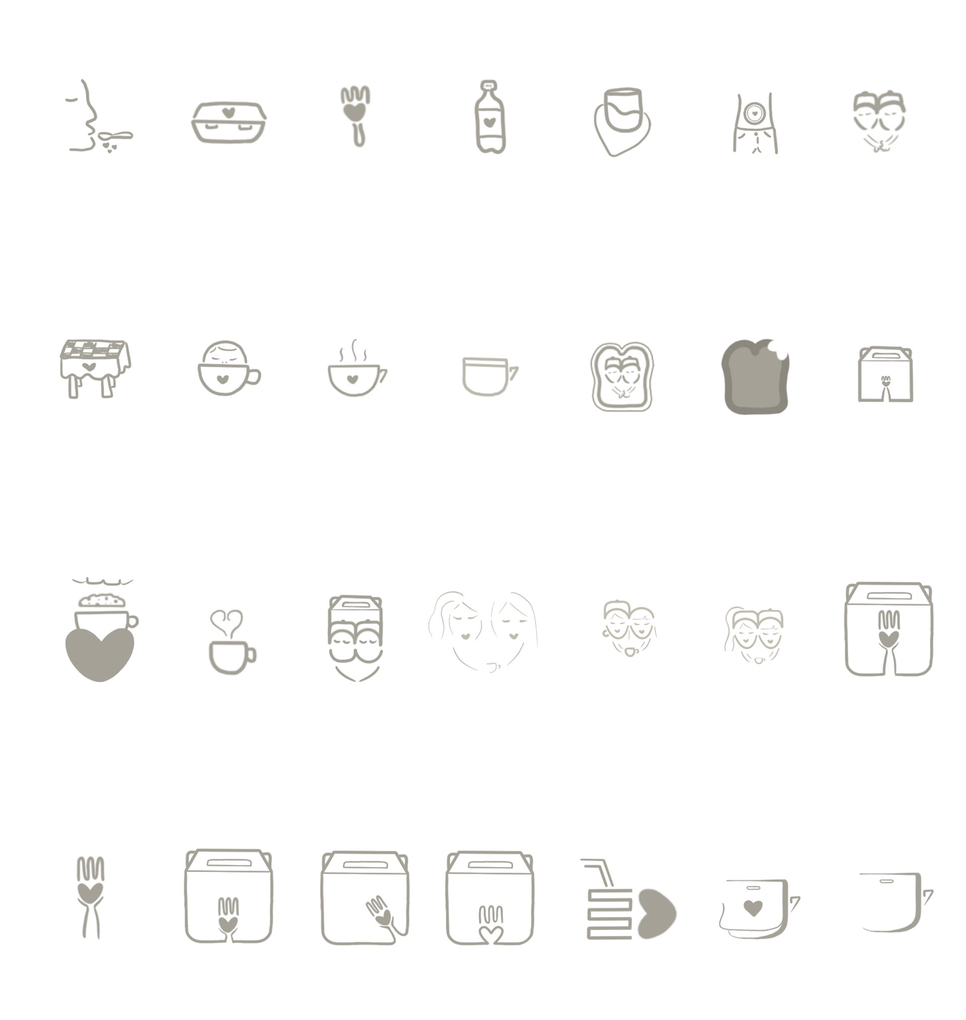
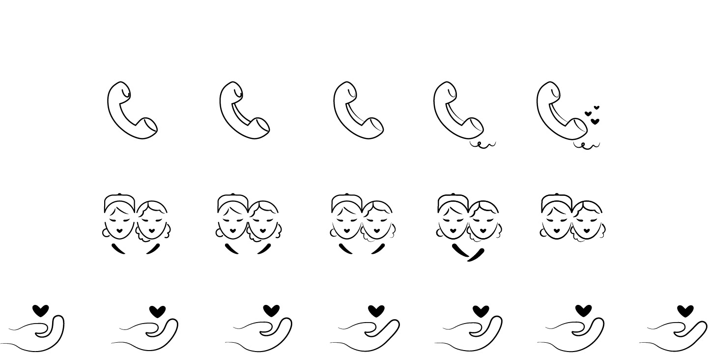
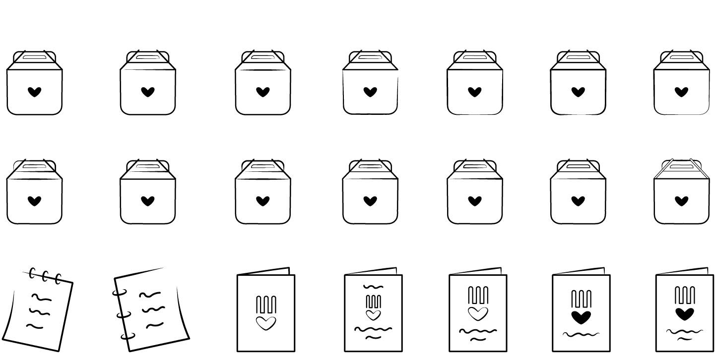
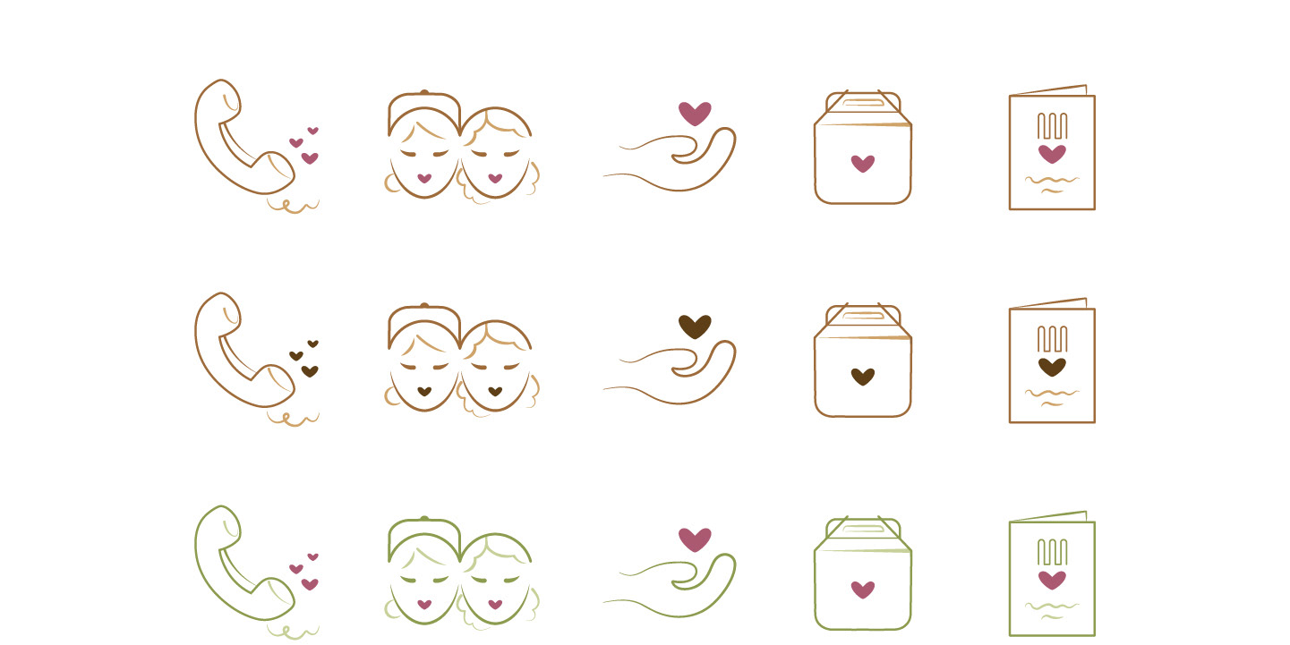
EVERYDAY CAFE ICONS PROCESS
Icon Iterations
Working in black and white to produce effective icon forms to communicate "Contact Us," "Our Mission," "Donate," "Order," and "Menu." The decision to incorporate the heart in every icon was made to fit cohesive alongside the Everyday Cafe mark.
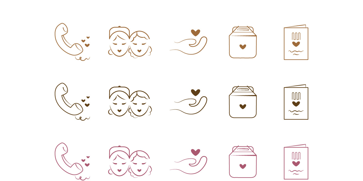
Color Exploration
Exploring the usage of one color versus three.
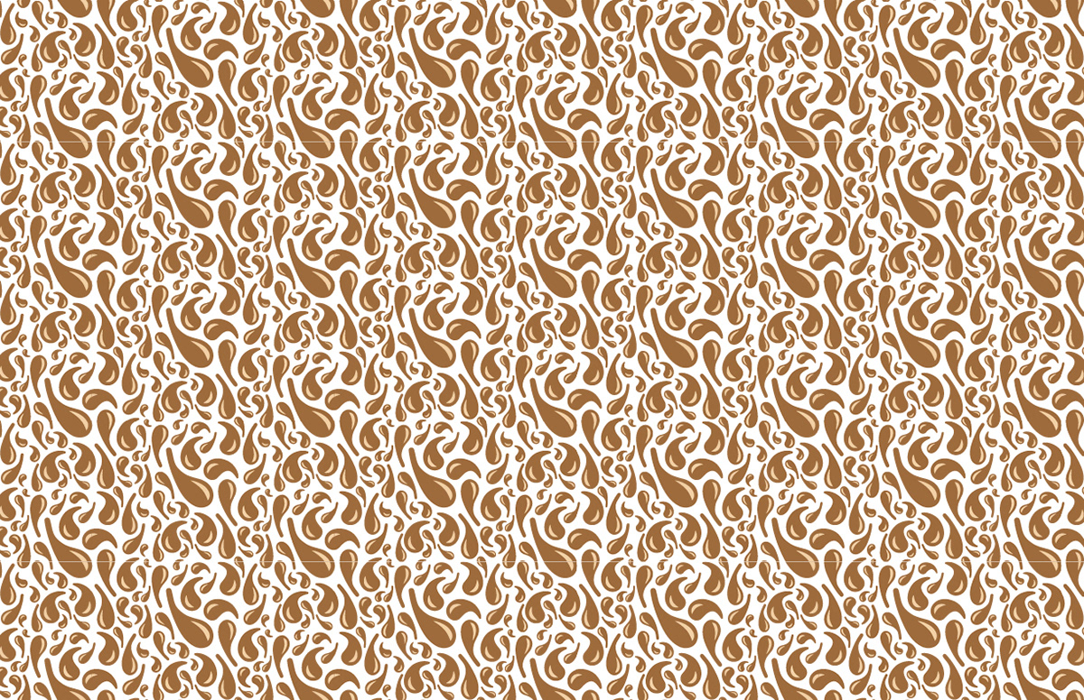
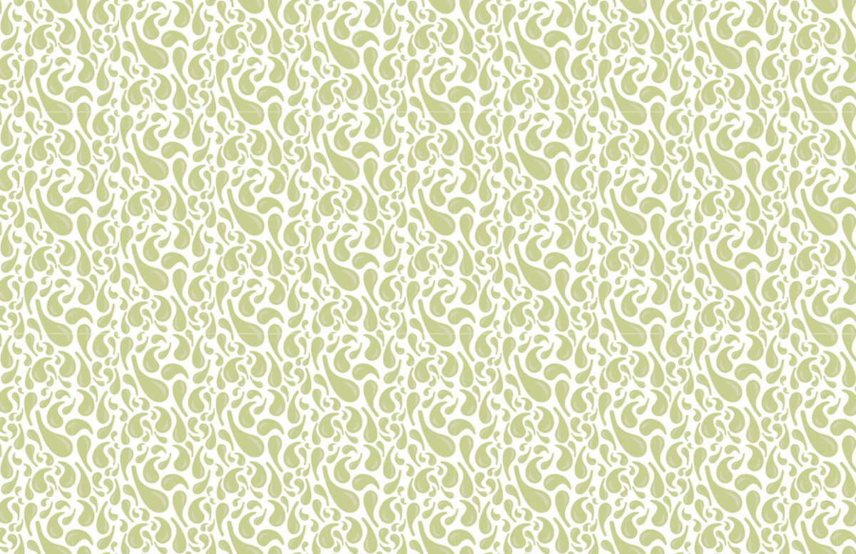
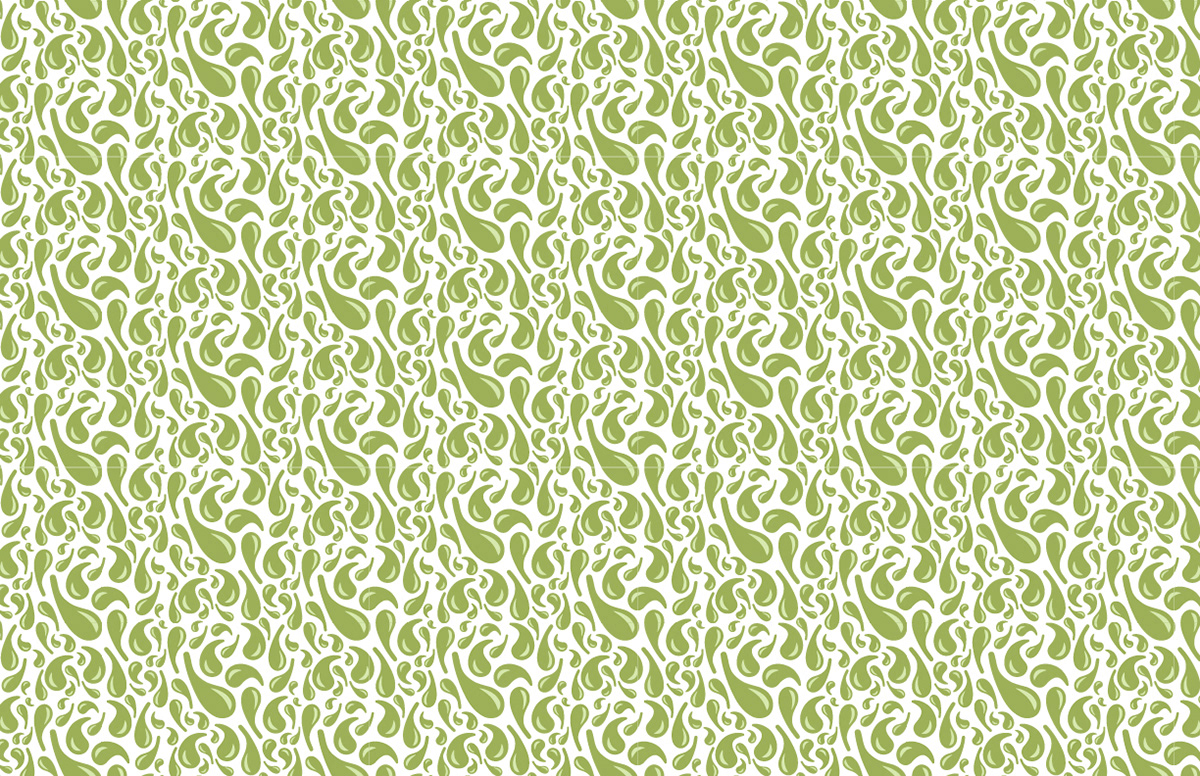
EVERYDAY CAFE PATTERN PROCESS
Forming Droplet Clusters
Rectangular, circular, and square-like clusters were designed with the intention to create a seamless pattern for Everyday Cafe utilizing the droplet component existing in the mark.
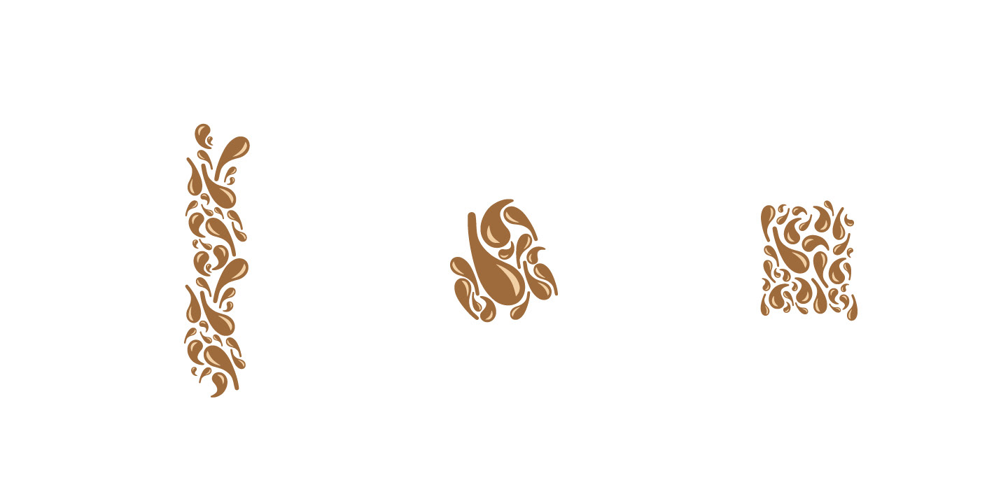
The first attempt had too much negative space and it didn't feel like it "puzzled" together well. The second attempt was better, but the clusters were still very obvious and easily detectable. The third attempt was perfect. There weren't any inconsistent gaps and most importantly, the pattern was seamless.
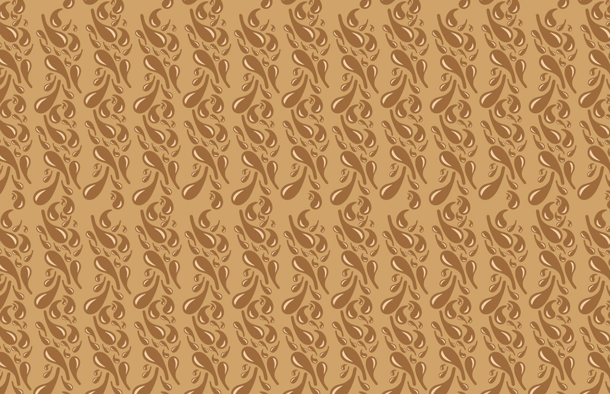

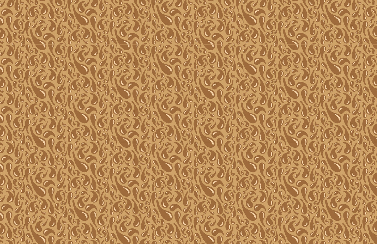
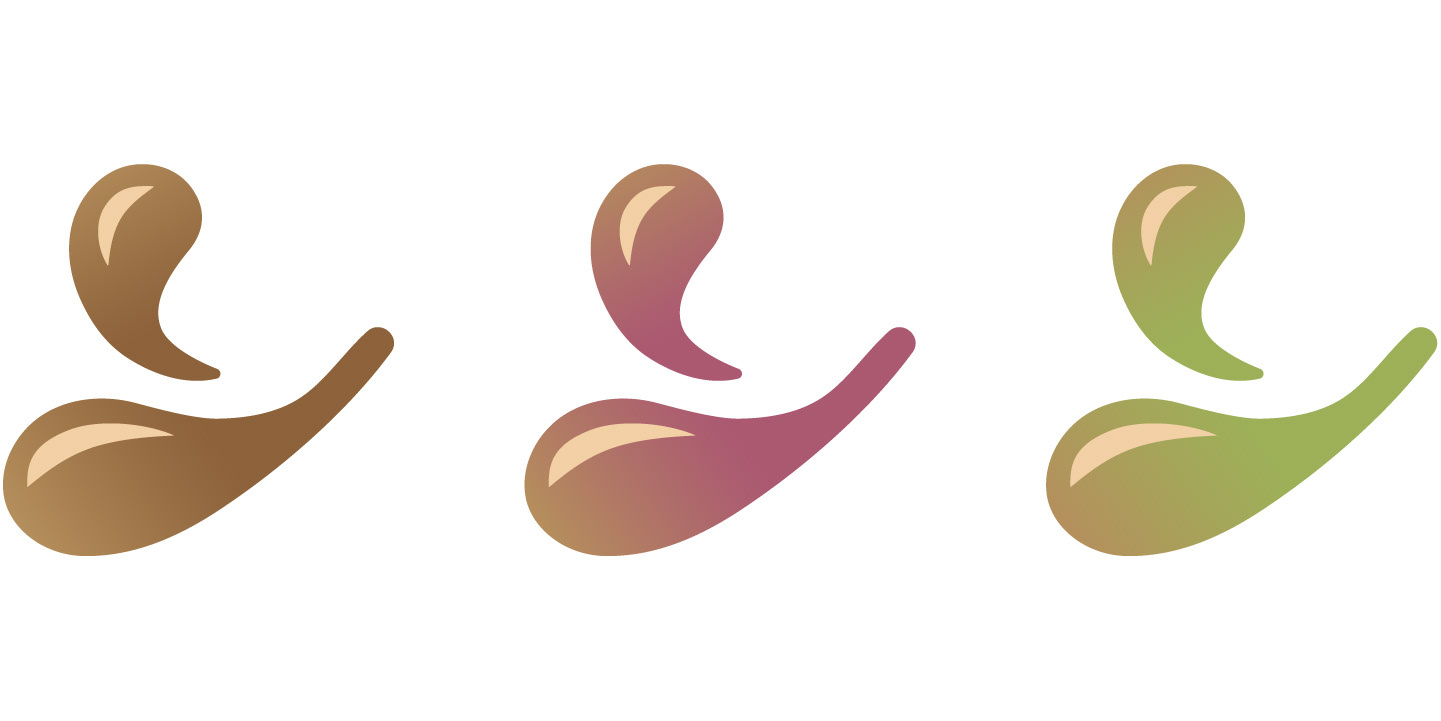
Pattern Color Exploration
Ultimately, the decision was made to keep it in the brown colors. The brown version of the pattern was bolder and it was also easier on the eyes.
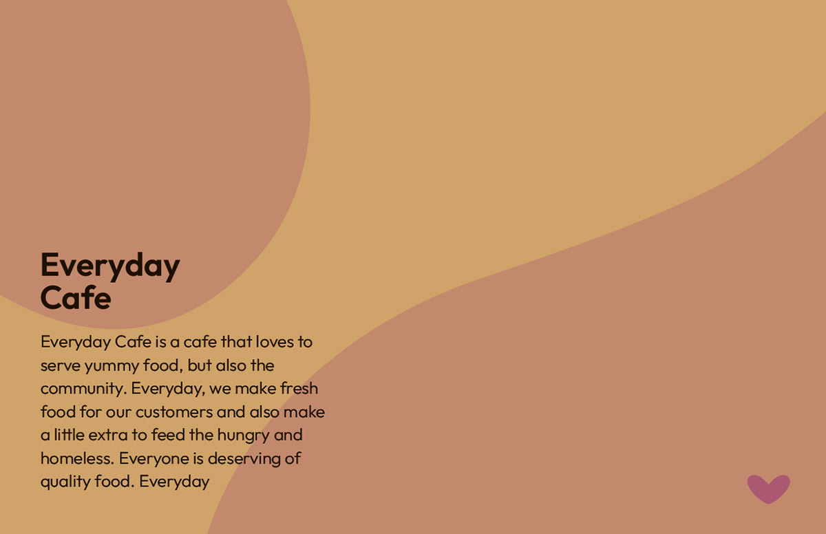
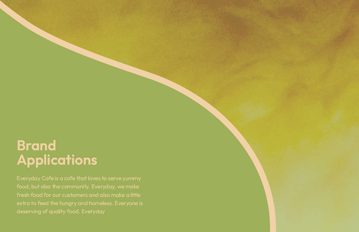
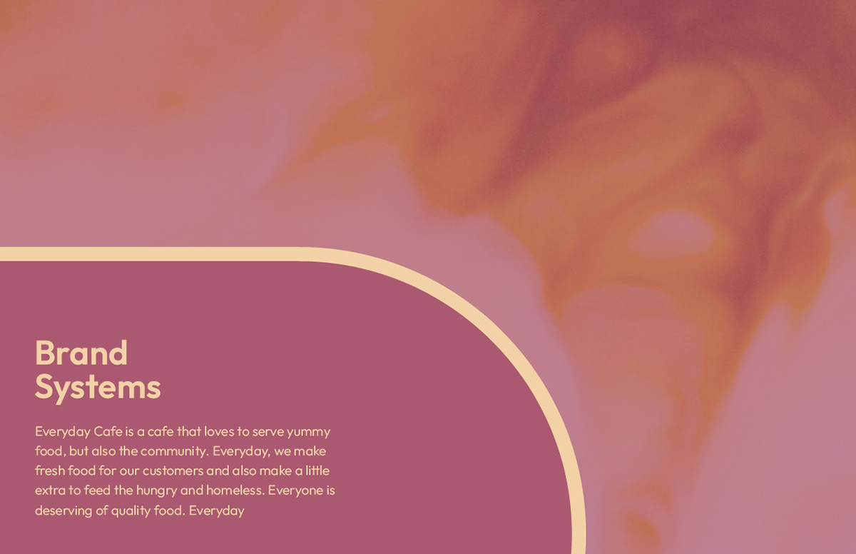
EVERYDAY CAFE BRAND GUIDE BOOKLET DIVIDER PAGES PROCESS
First Attempt of Designing Divider Pages
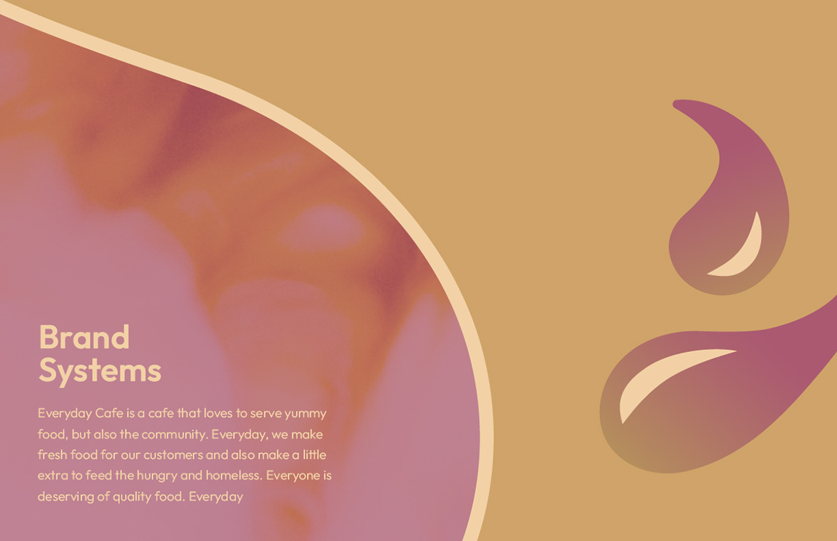
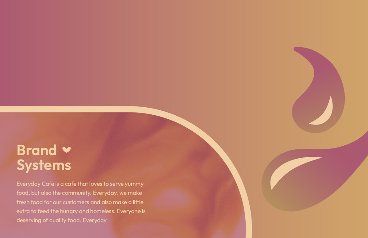
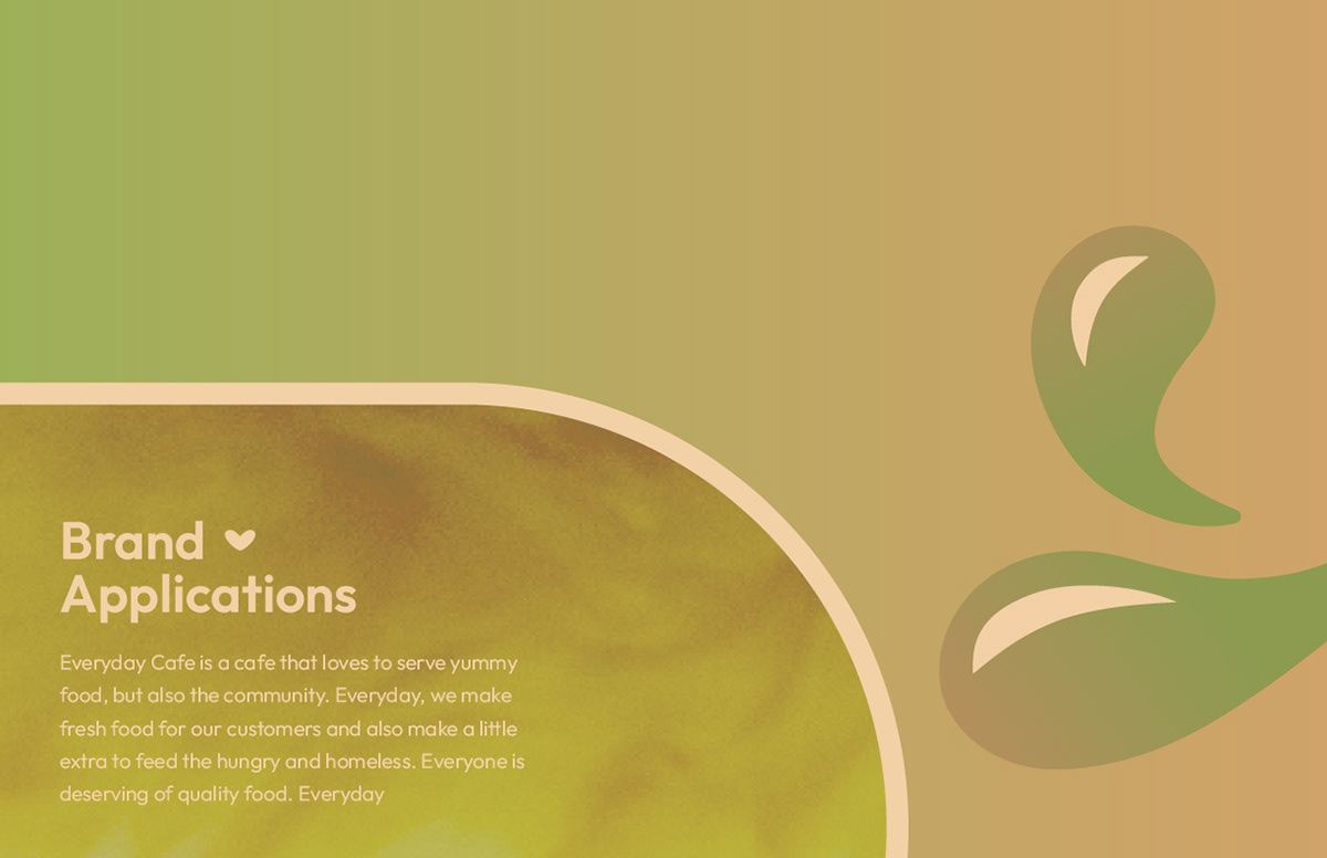
This attempt utilized the droplets again, found in the Everyday Cafe mark.

The opacity in each was decreased and a different color found in the color palette was applied to communicate the change in each section of the brand guide. The heart from the mark was also added on the bottom right corner to continue the pattern of sprinkling it in throughout the brand. Overall, the design felt flat, so improvements needed to be made.
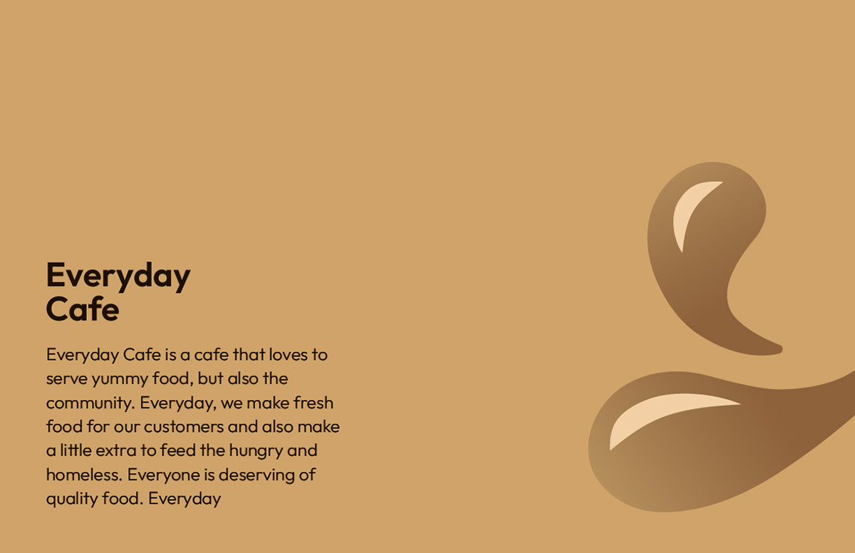
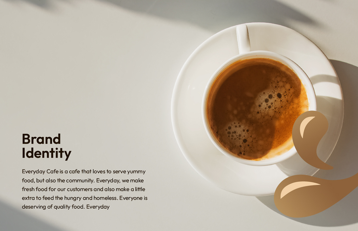
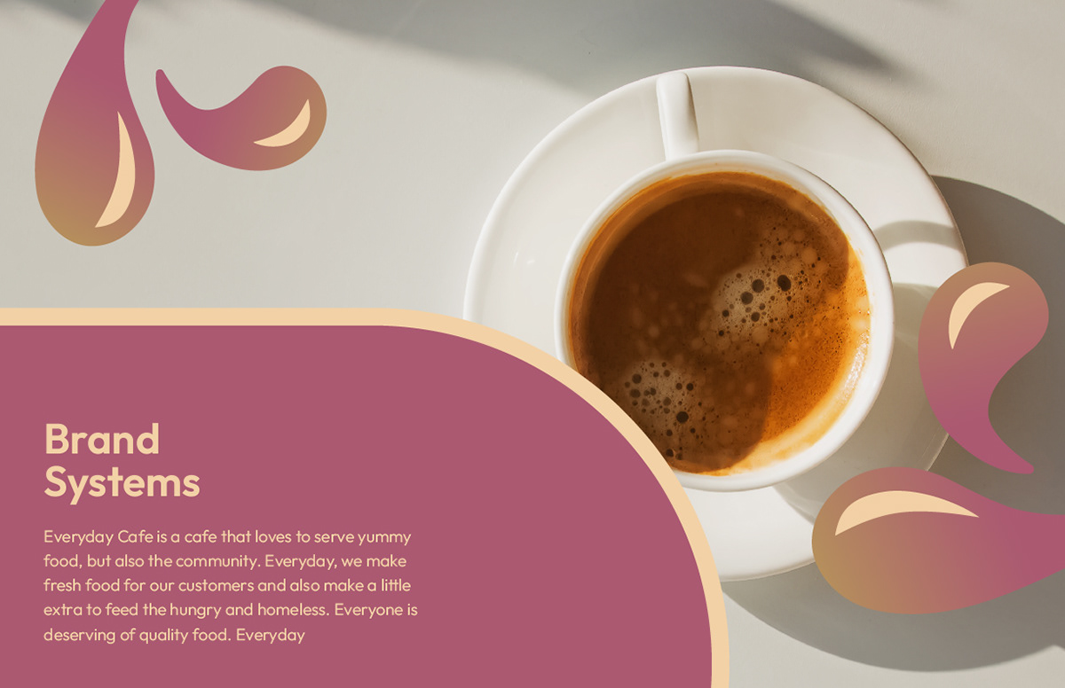
Second Attempt of Designing Divider Pages
This attempt also utilized the droplets found in the mark. A slight gradient was added to make them come to life.
This version of the droplets was a nice idea, but the way they interacted with the text on the page wasn't ideal.
Introducing the idea of combining graphics with real images. This was a creative approach, but it still didn't quite work together.

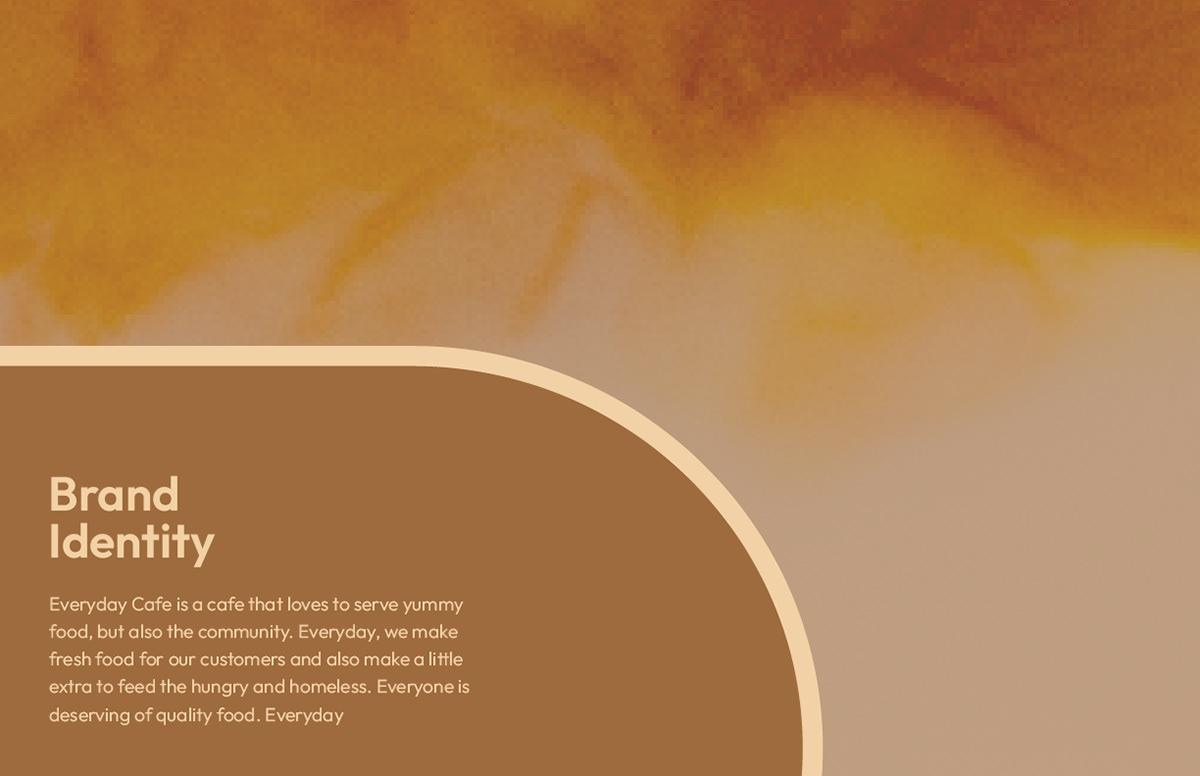
Third Attempt of Designing Divider Pages
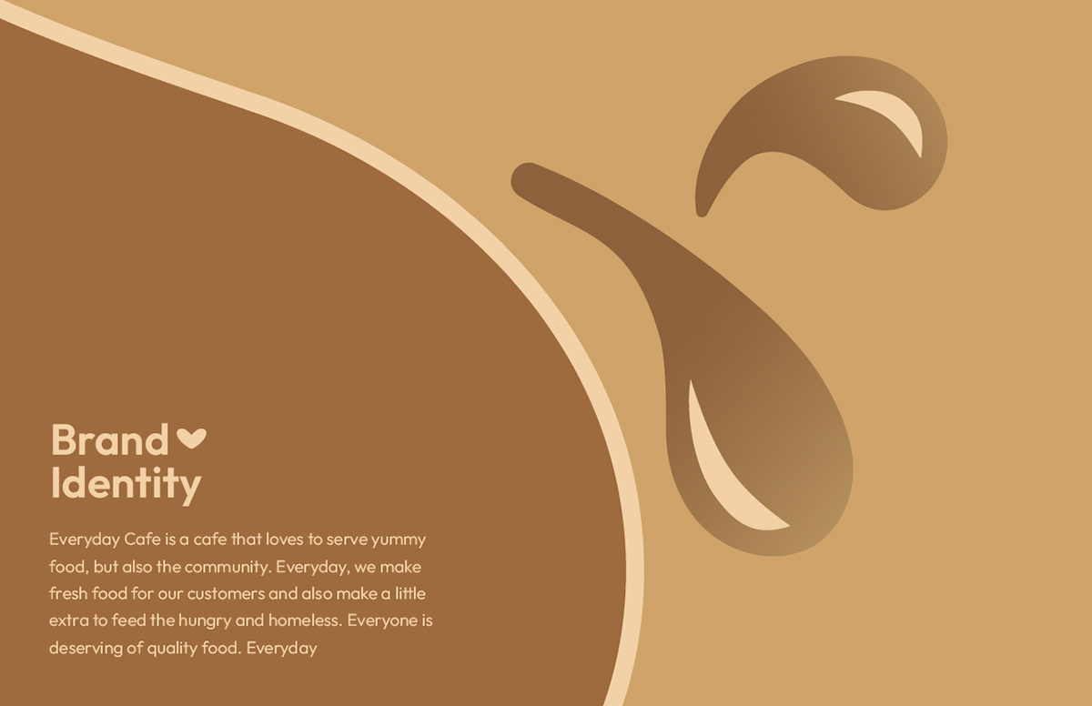
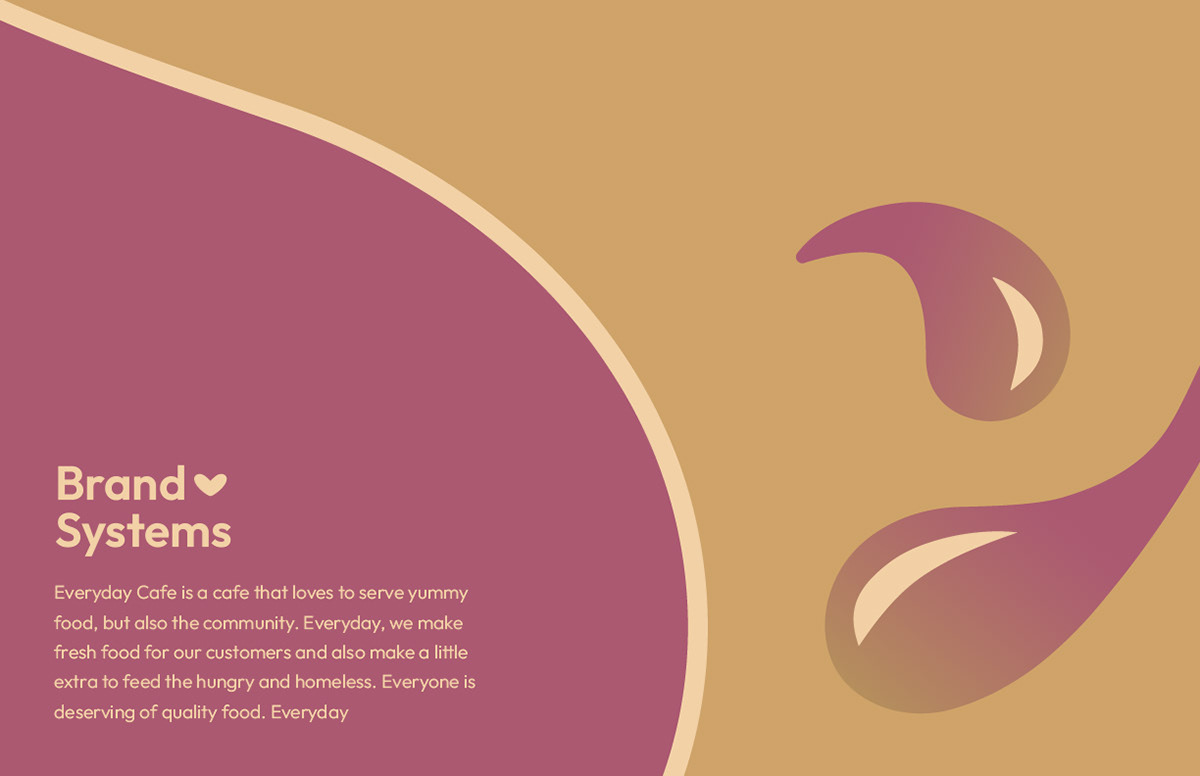
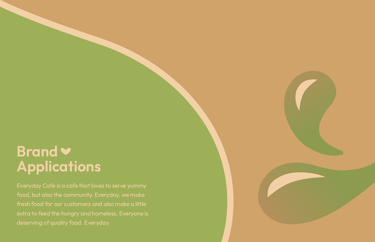
Utilized components of Everyday Cafe's animation.
Another way of tying Everyday Cafe's existing elements into the brand guide. The idea was great, but still felt like something was missing.


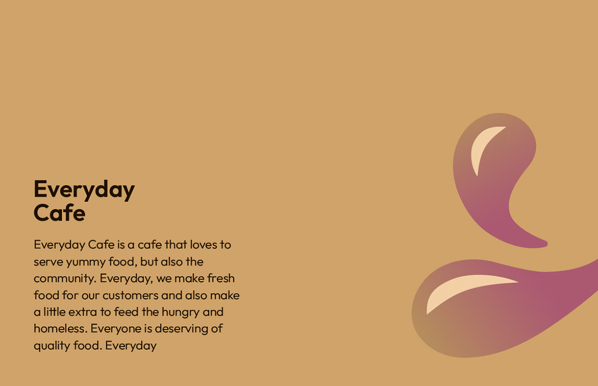
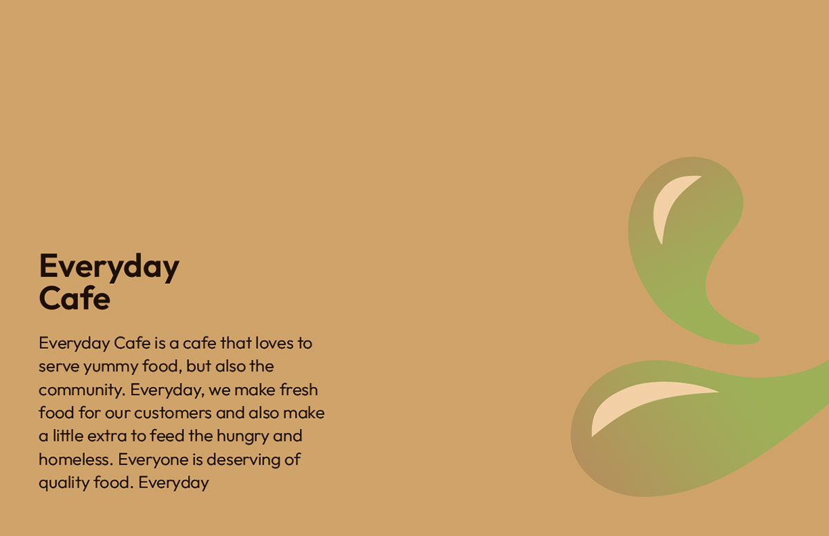
Fourth Designing Divider Pages Attempt
Utilized one singular droplet with a fill and stroke.

First appearance of arranging droplets differently throughout pages, which added dynamic movement. The idea of filling the droplet with a milk to coffee swirl, as well as changing the background from a solid color with the same texture was also explored.
Fifth Attempt of Designing Divider Pages
Explored the idea of using a gradient background, which overall had an overwhelming appearance alongside the already, gradient-filled droplets. Switching the scaled droplet with fill and stroke for an arched shape was also considered.
Sixth Attempt of Designing Divider Pages
Bits and pieces of previous attempts were used for this concept. A step back was also taken towards a more simplistic approach without the gradient-filled droplets.
Seventh Attempt of Designing Divider Pages
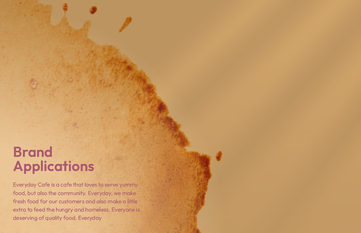
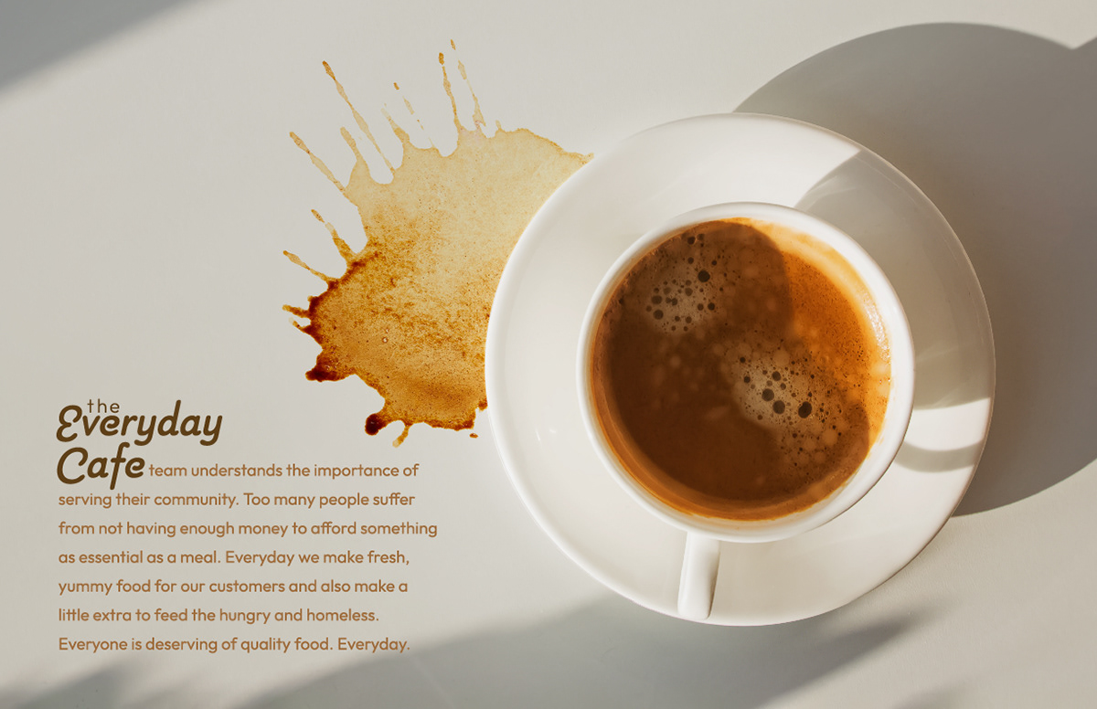
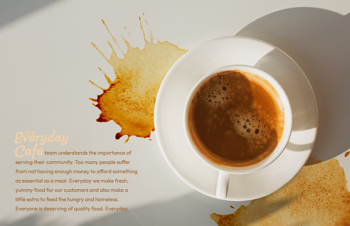
A new component was introduced. The coffee splatter paired very well with the concept of a cafe. The idea of layering a shadow overtop to add more texture to the page was also explored.


Every attempts was a step that led to the final set of divider pages used in the brand guide.
Intro and Outro Page Exploration
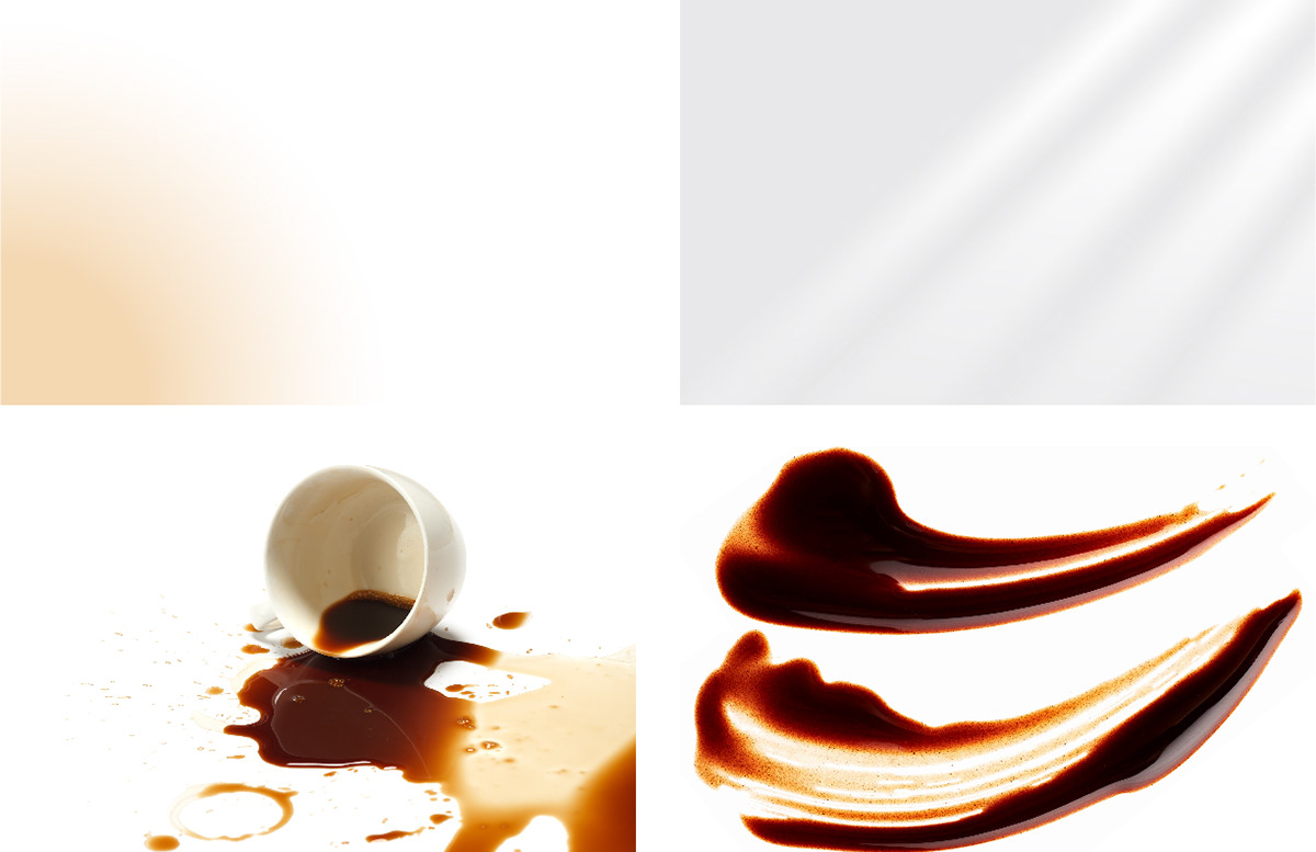
Components Used to Explore Intro Page Layout

Combinations
The possibilities one could produce with only a handful of components was discovered. There were endless amounts of potential outcomes in just this one page.


Outro Page Components and Result
Text Exploration
Exploring the idea of utilizing the gradient filled droplets. The concept of applying an effect to the text was creative, but ultimately impractical. The decision was made to keep the text normal, so there was no need to include the droplets again.
The text needed further attention, so a process of experimenting with typeface combinations and placement occurred.